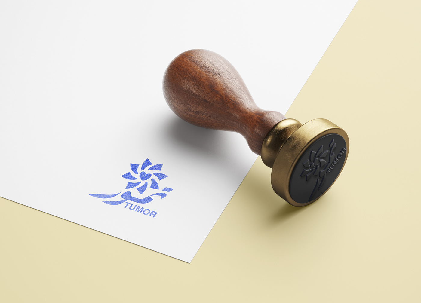
TUMOR LOGO

Objectives of the logo: To be a symbol of the project of palm cultivation and date production from A to Z.
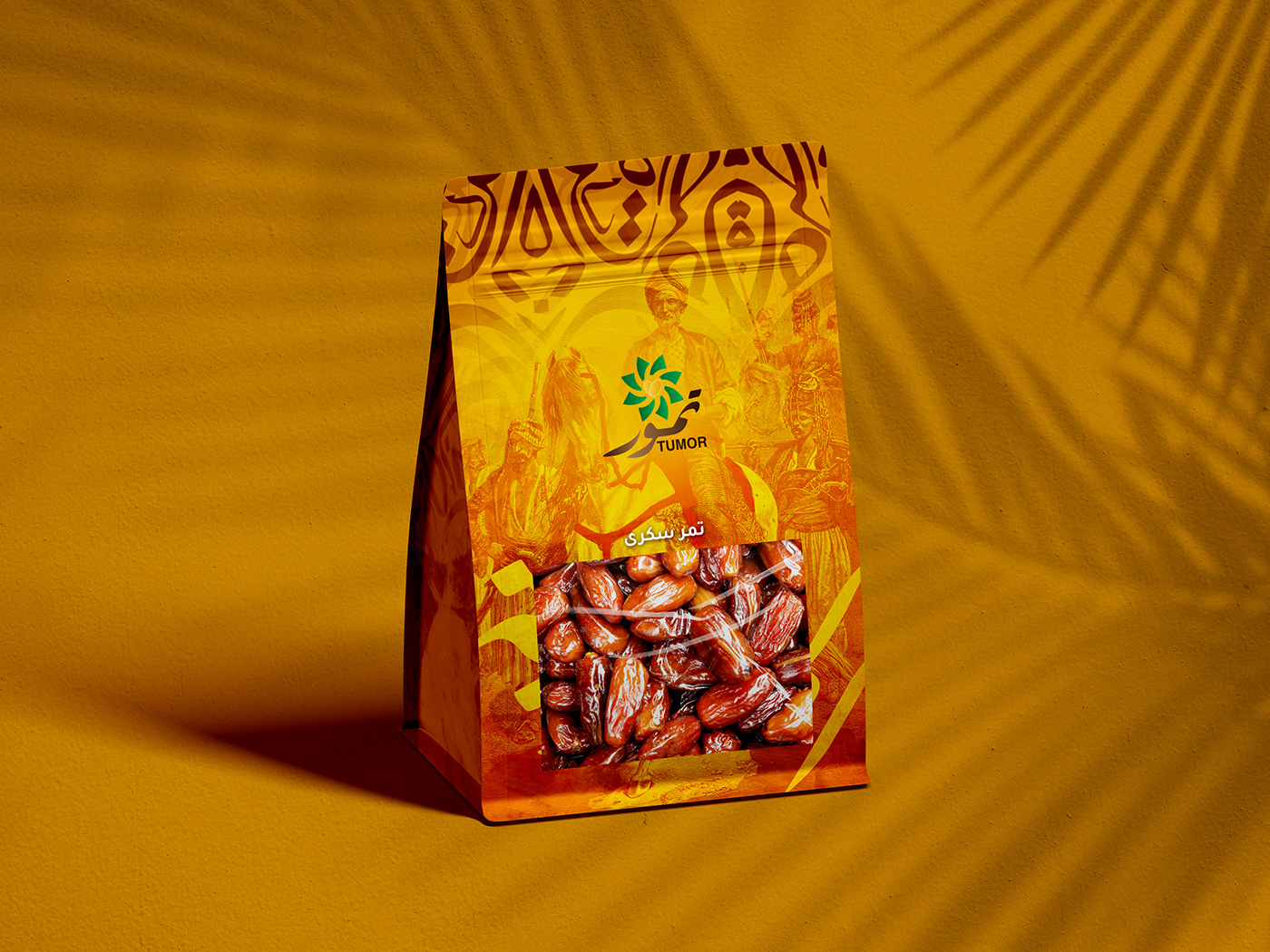
Create a visual identity with an Arabic background suitable for consumers
And visualize the shape of the packaging
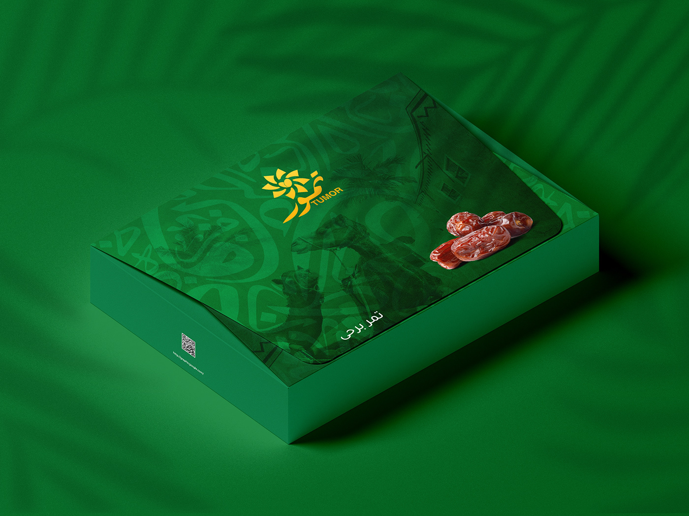
Create a visual identity with an Arabic background suitable for consumers
And visualize the shape of the packaging


The logo is inspired by the shape of the palm from a horizontal perspective, to directly reach the idea of planting palms in the form of palm fronds. Surrounding the fruits of dates on Heart symbol in order to serve the direct sales of the product and the consumer's sense of admiration for the final product. The word "tumor" originated in an ancient Arabic script to connect palm trees to the Arab region and culture


Palm colors and the color of the main fruit were used in the project